Courses
We focused on a lot of details in order to make your courses be perceived as premium. This increases your revenue and retention.
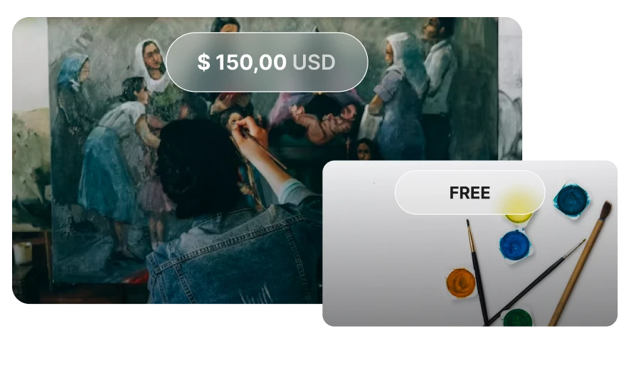
Choose to charge a fee for your course to generate revenue, or offer it for free as an effective way to draw in new users.
Set the difficulty level for each course - beginner, intermediate, or advanced. This helps your users to instantly identify the course that's right for them.

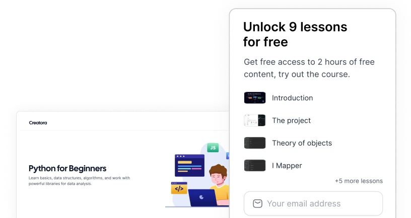
Increase up to 200% your sign up rate by leveraging the free lessons in your courses.
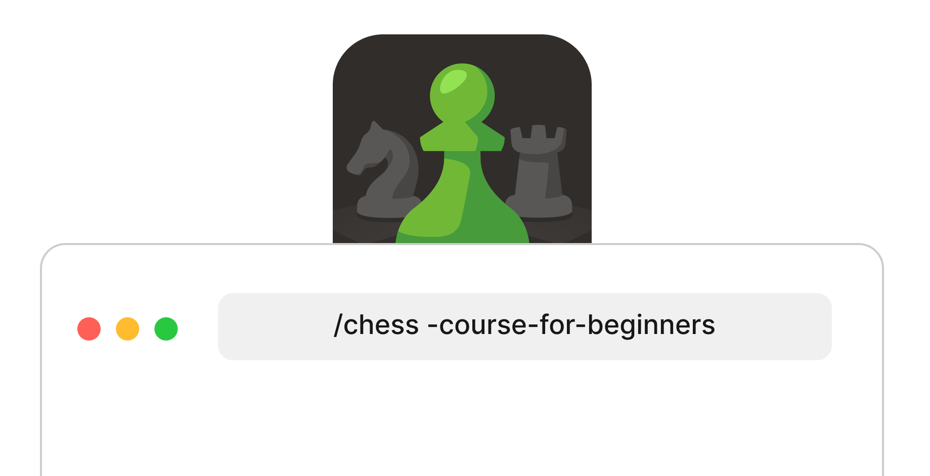
The URL address of your pages is crucial for appearing in the top results on Google, that's why you can customize it for each course with the keywords you consider most important.
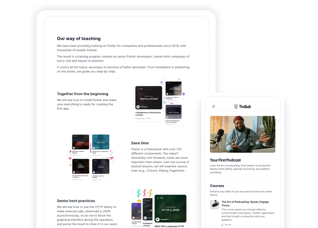
With over 12 ready-to-use blocks, you just need to insert your text and images, without worrying about the right line spacing, font, color, or optimizing the images.
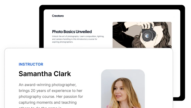
When learning it's important to trust your teacher. With the dedicated teacher's bio you will be able to communicate authority.
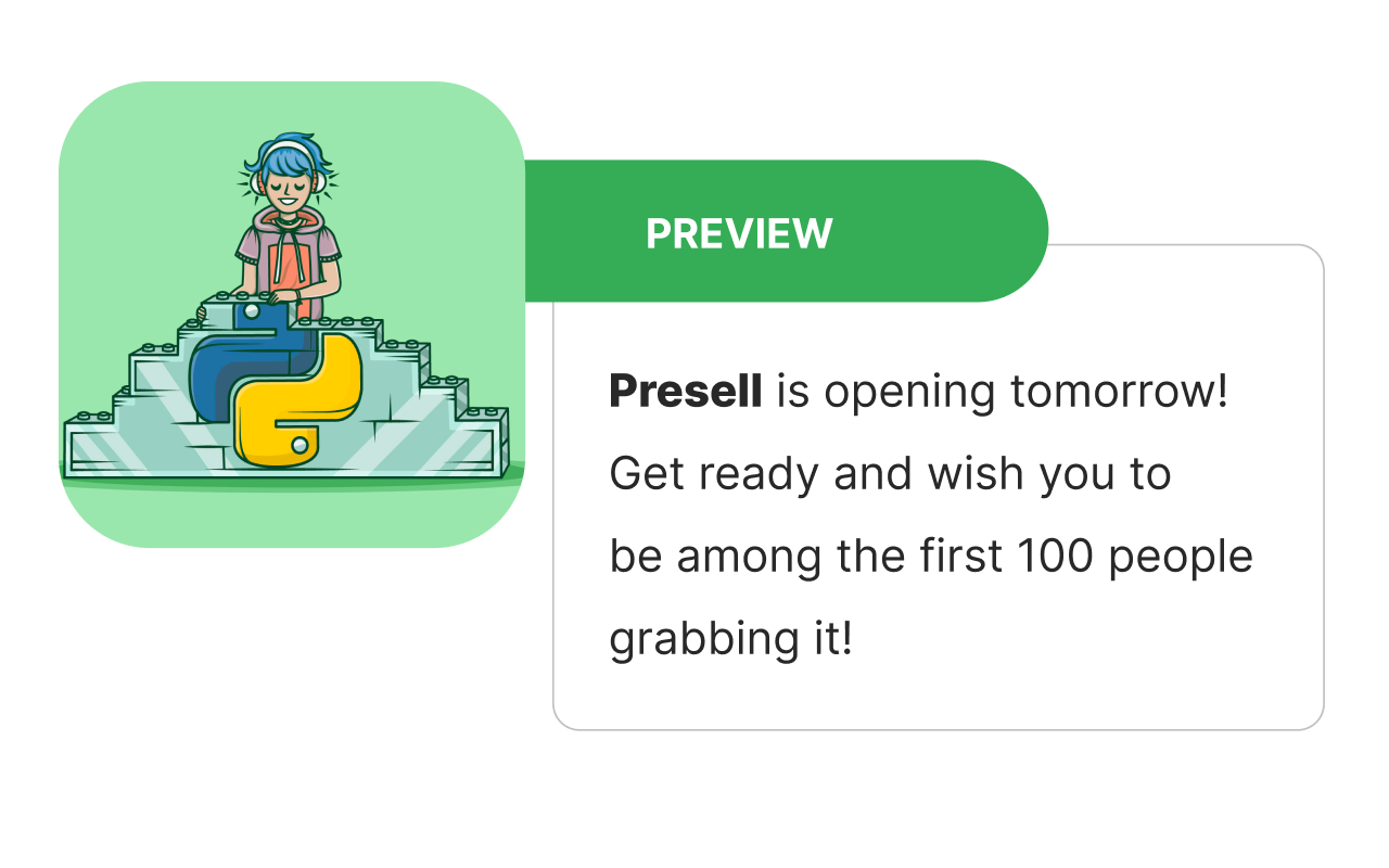
Announcing the upcoming release of a new course, even before it’s completed, increases the hype around it and warms up potential buyers.
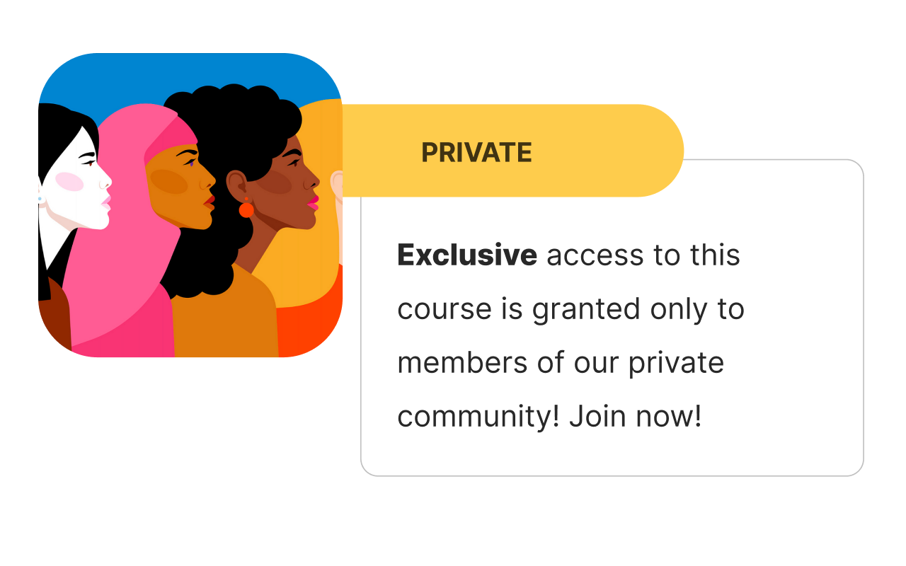
Some courses are exclusive, others are outdated. You can grant access just to some students without showing the course to everybody.
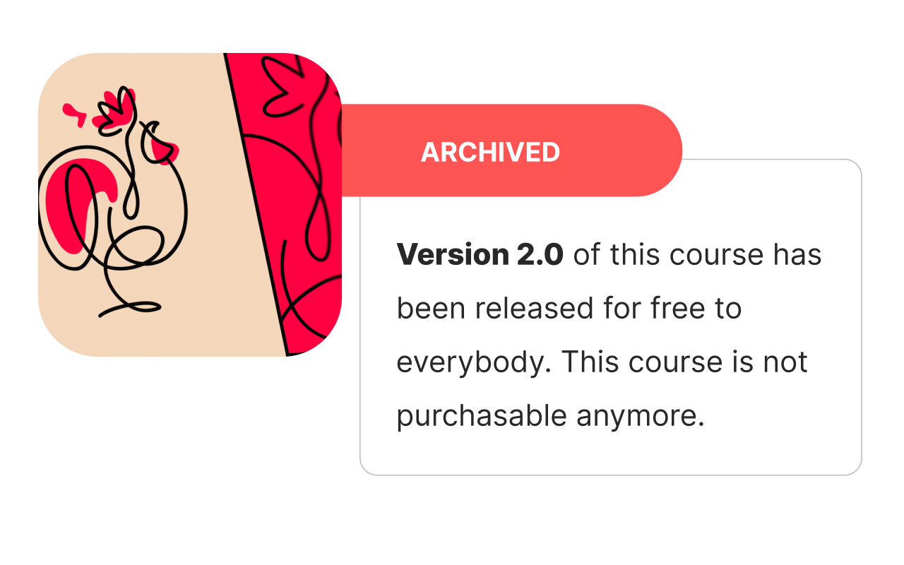
You can remove an outdated course from sale and hide it from public, without deleting any progress or sales data.
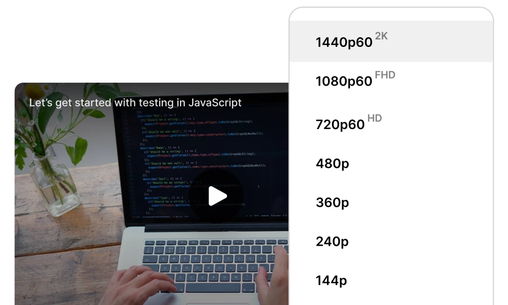
Upload your videos in 2K to provide crisp and clear lessons. Your students will become so used watching high quality videos that they're gonna miss it when studying on another platform.
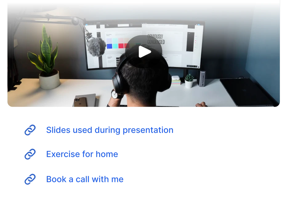
Attach resources to lessons in order to increase the value: files, documents, images. Choose whether to make them accessible to everyone or only to those who have purchased the course.
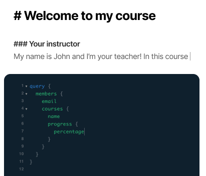
Much more than a description. Thanks to markdown, under each lesson you can add code, images, and all the styled text you need.
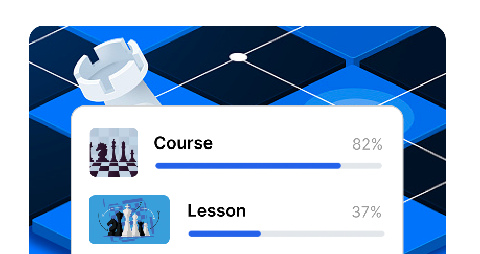
We track the percentage of each lesson viewed. This is useful for issuing certificates and for having statistics on the effectiveness of the course.
You can enable the comment section under your lessons, allow students to ask questions and foster a sense of support and belonging in your community.

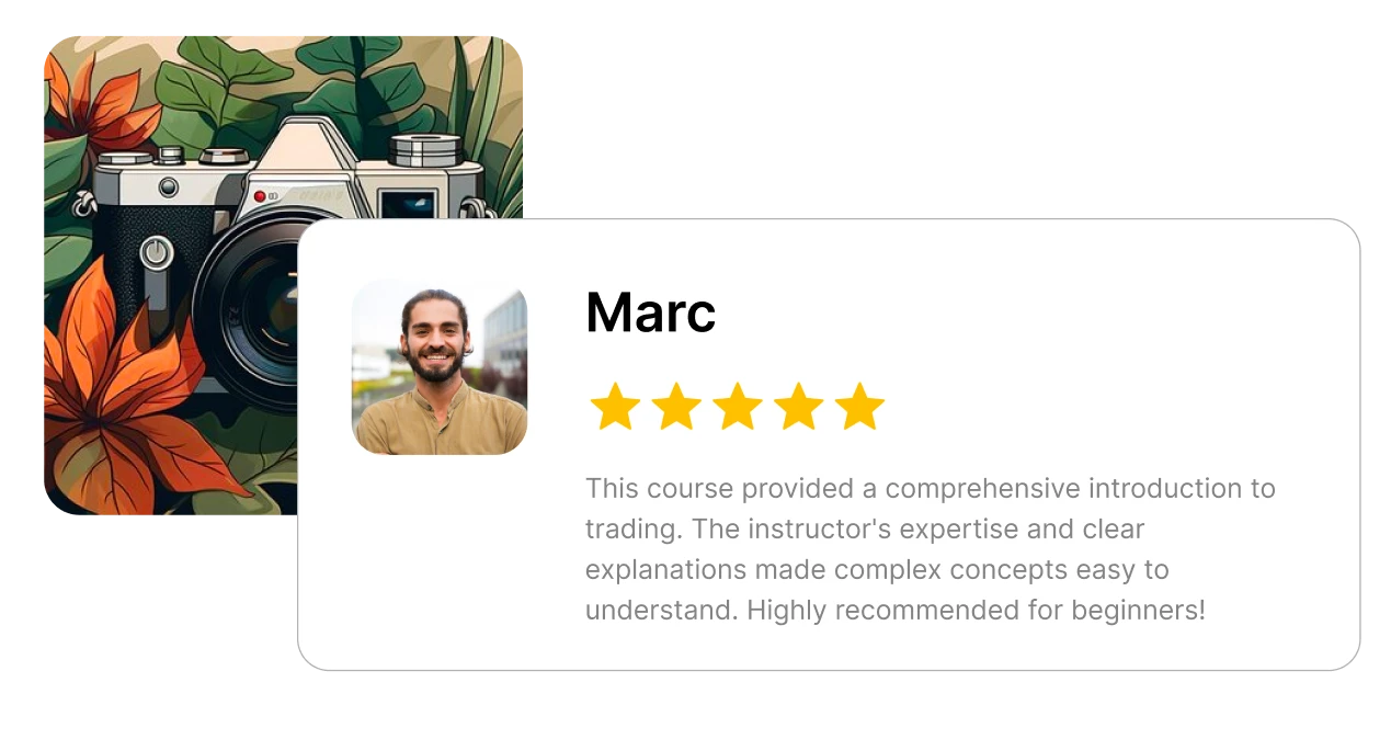
Students can write a review only after completing a customizable percentage of your courses. This allows you to provide social proof and increase trust in your courses.
Threads
In each lesson, you can allow your students to create new threads to ask questions and share resources.
Students can attach images, such as screenshots, or files, such as code snippets.

Only students of the course can create new discussions and comment. This increases the perceived value of your course.
It's possible to receive email notifications when there are new replies in discussions, without having to participate with a new comment.
Reviews
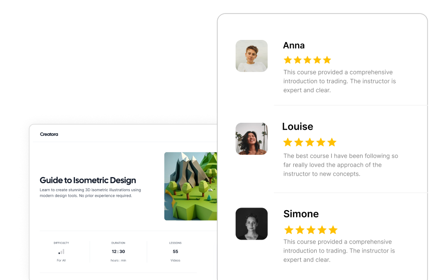
All you need to do is offer quality content to your students. Your platform will take care of collecting reviews and displaying them in the right places.
Only those who have purchased the course and completed a customizable percentage can write a review.
Every course has its own dedicated page showing all its reviews, thus helping those undecided if to purchase to make a decision.
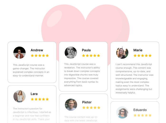
Automatically generate a Wall of Love page with reviews from all courses. If activated, it can be accessed directly from the platform's main menu.
Learning Paths
With multiple courses it's easy for students to get confused and not know where to start from. With learning paths you can group your courses into a timeline.
When you have multiple courses, it's crucial to communicate to members the order in which you want them to be followed.
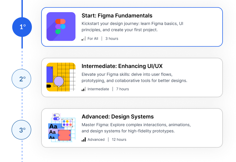
The timeline visually displays the progress within a learning path and the missing courses.
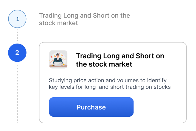
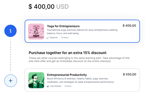
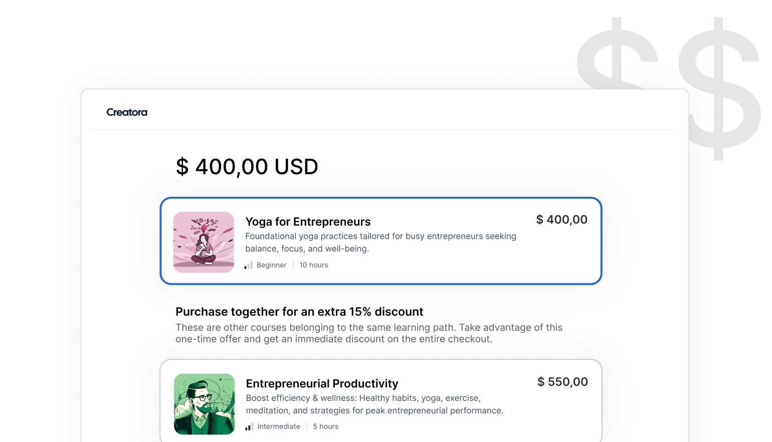
While in the checkout page, the other courses in the learning path are automatically showed as order bumps for the current course.
Students
Treating students as real people means supporting their transformation, with gentle nudges towards their goal.
Having to fill the password field slows down leads while unlocking free lessons and purchasing courses, which is why it has been removed. To become a member, only the email is required.
The platform automatically detects and blocks sign ups of members using temporary emails.

Detect and flag any shared accounts. Then, it's up to you to decide if and how to act. The member is never informed of its account being flagged.

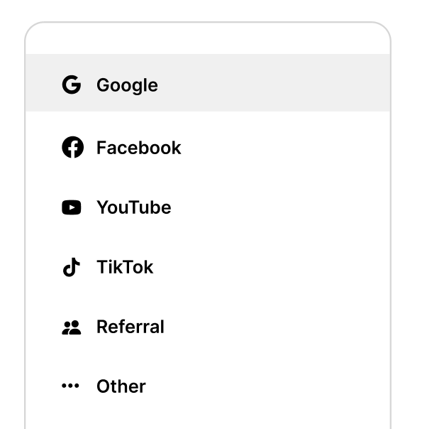
During onboarding, you can ask your members how they found you. This way, you'll know how your acquisition channels are performing.
If a member doesn't want to upload their photo, they can choose from 60 ready-to-use colorful avatars, including Frida Kahlo and Gandhi.
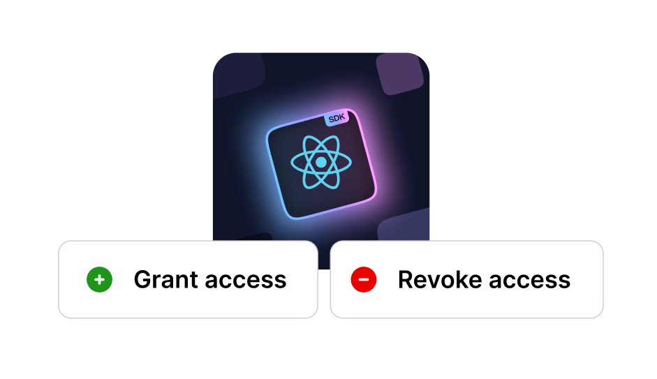
If you have sold outside the platform or a member has requested a refund, you can manually grant or revoke access to a course.
Acquisition funnels
We have analyzed how visitors interact with the platform and integrated a funnel system into the most visited pages.
All funnels require only the email, immediately create an account for the new member, and unlock the incentive.
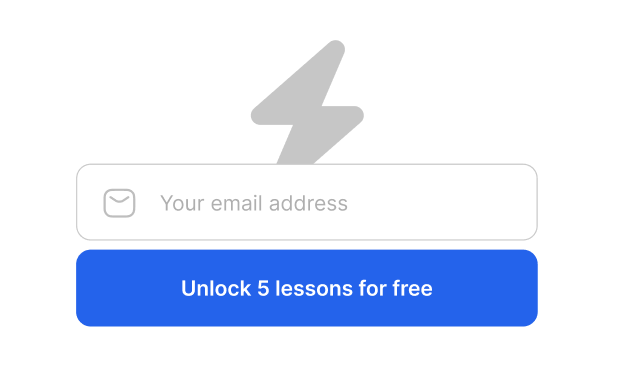
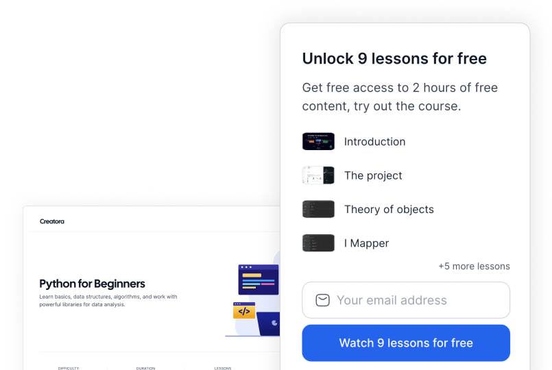
Warm leads can register directly from the video player to unlock a free lesson, from a course's landing page, from the homepage, and in the checkout page.
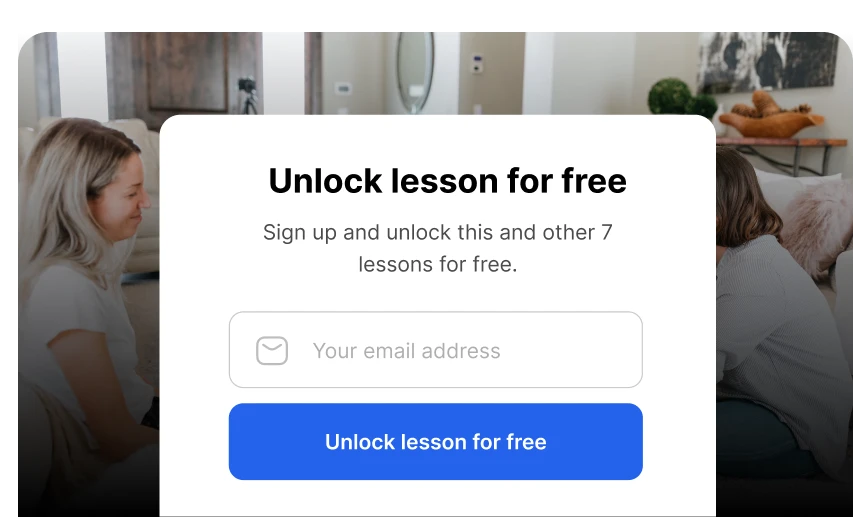
The platform automatically leverages free lessons and the reward at the end of onboarding to encourage signing up.
Onboarding
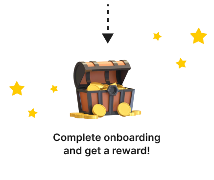
Welcome new students and guide them towards the first steps on your platform, rewarding their commitment with a gift.
Ask new members how they found out about you. This way, you'll know how your acquisition channels are performing.
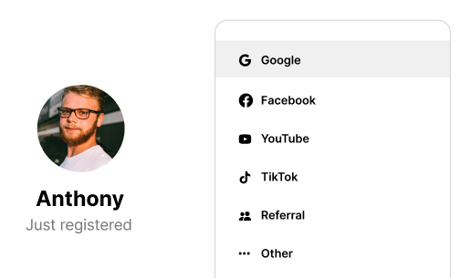
Reward completion with a discount, access to an exclusive resource, a link to your private community, or anything else you think it's valuable.
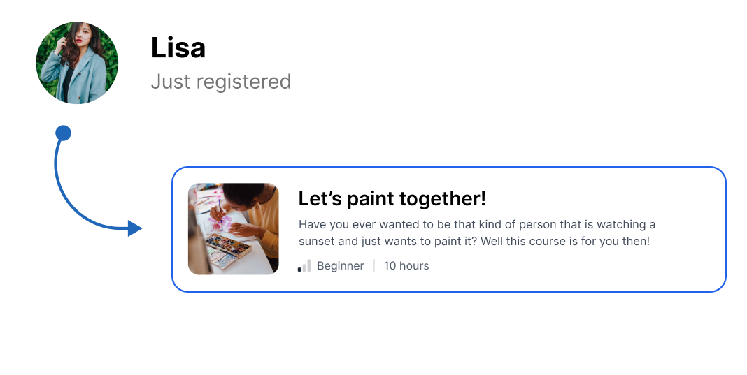
At the end of onboarding, recommend which course to start with. This prevents new members from feeling confused about what the next step is.
Checkout
The checkout page structure is the result of data collected over the last 2 years: fast and frictionless, conveying security and encouraging cross-selling.
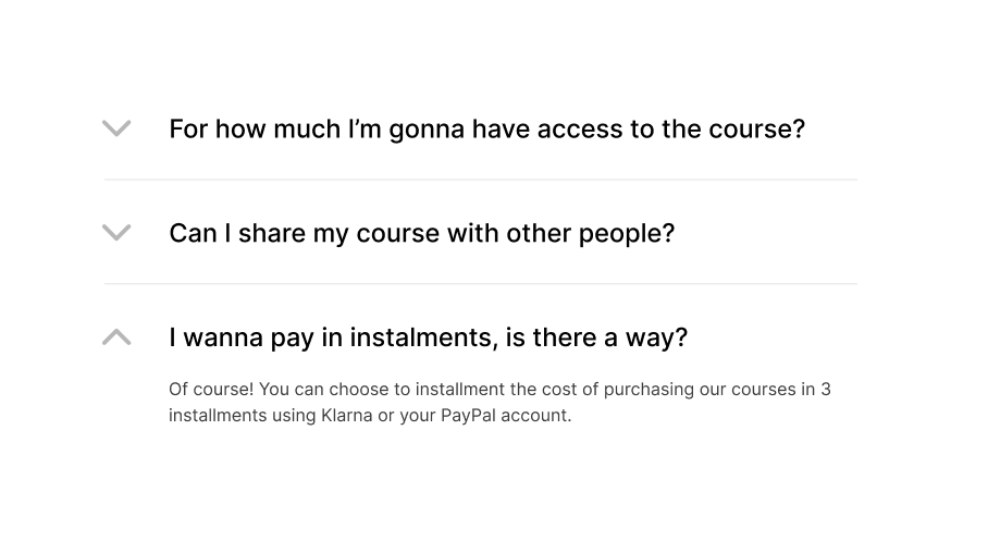
Allow your members to pay with Credit Card, Apple Pay, PayPal, and using Klarna to purchase in up-to 3 installments. Receive payments directly into your account.
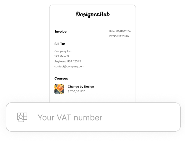
Support purchase invoiced to a company. The company data is saved and filled automatically on next purchases.
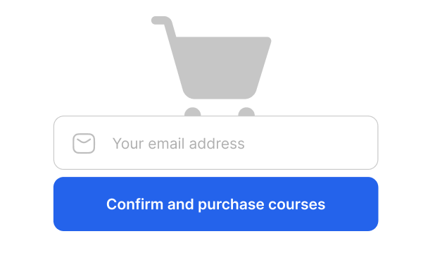
If a guest user is about to make a purchase, only the email field is requested. The other data, like his name, will be collected during the onboarding process.
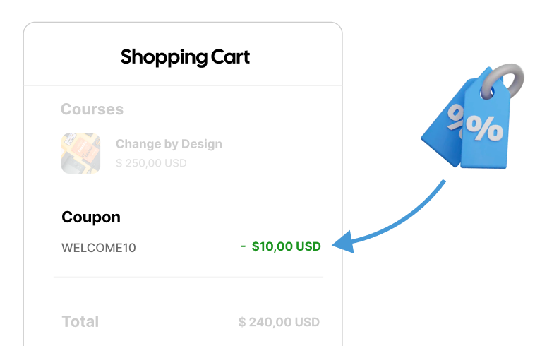
Both fixed and percentage discounts are supported. You can set a duration, a maximum number of uses, and choose for which courses the discount is valid.
The study path is integrated into the checkout page to encourage cross-selling through a graphical representation of a timeline and incentivized through a customizable bundle discount.
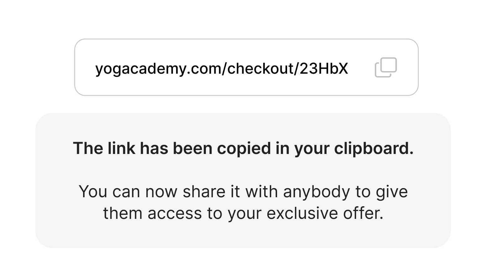
Create personalized offers accessible only through a link, useful for creating special promos or commercial offers for particular members and companies.
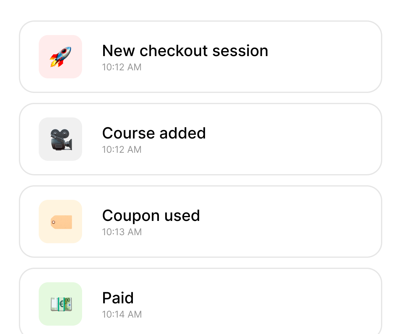
The platform tracks member's behaviour during each checkout session to help you understand which segments convert the most.
Anticipate any doubts a member may have before paying by answering the most frequently asked questions.
If the member doesn't find an answer among the FAQs, they can contact you directly by writing a message within the platform.

Orders
Keep track of your orders and keep the balance updated by tracking sales outside the platform, refunds, and disputes.
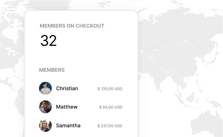
Monitor in real-time the number of members on checkout and how they behave.
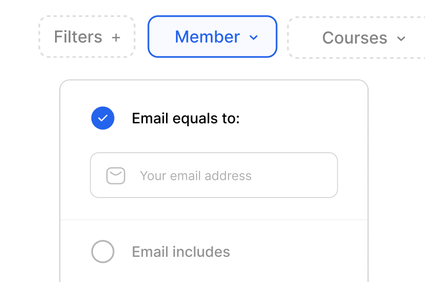
View all past orders and segment according to your needs thanks to over 10 filters.
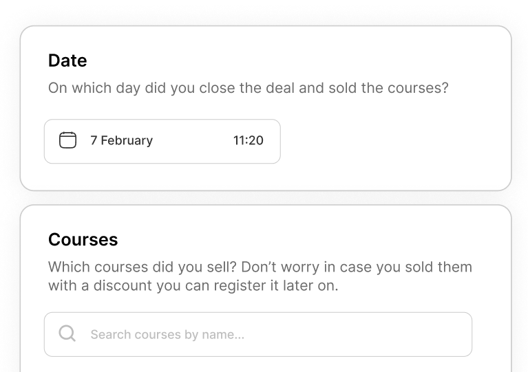
Track sales outside the platform, indicating the courses to be enabled and the discounts applied, allowing you have an updated balance.
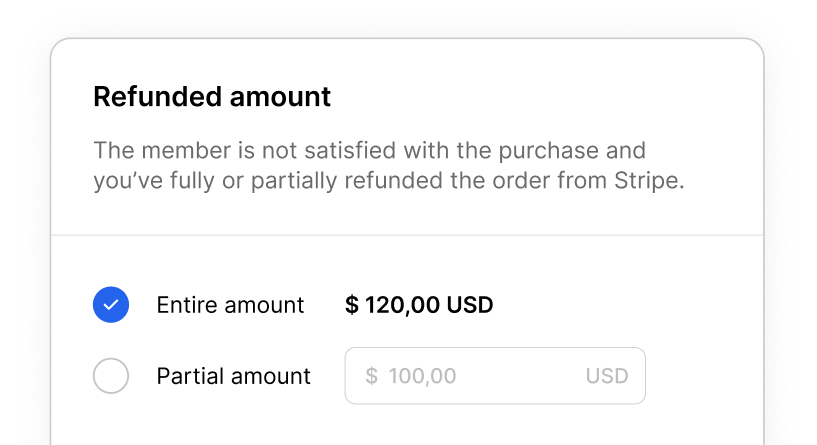
Partially or fully refund a member's purchase, choosing whether and which courses to disable. The platform automatically updates the balance as well.
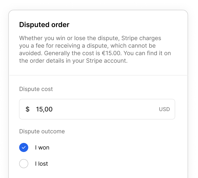
Flag an order as disputed, specify the dispute fee and disable access to the courses. The balance is automatically updated.
On each sale, the platform automatically calculates how much each course has made you earn, it takes into account discounts and external sales you've been adding as well.

Coupon
It's important to keep control over every promotion: create discounts, with or without limitations, and track how each coupon is performing.
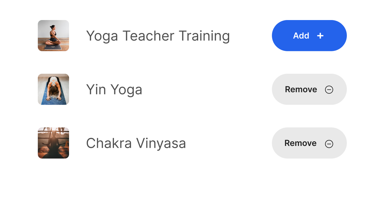
Choose whether to apply your promotions to all courses or limit them to specific courses.
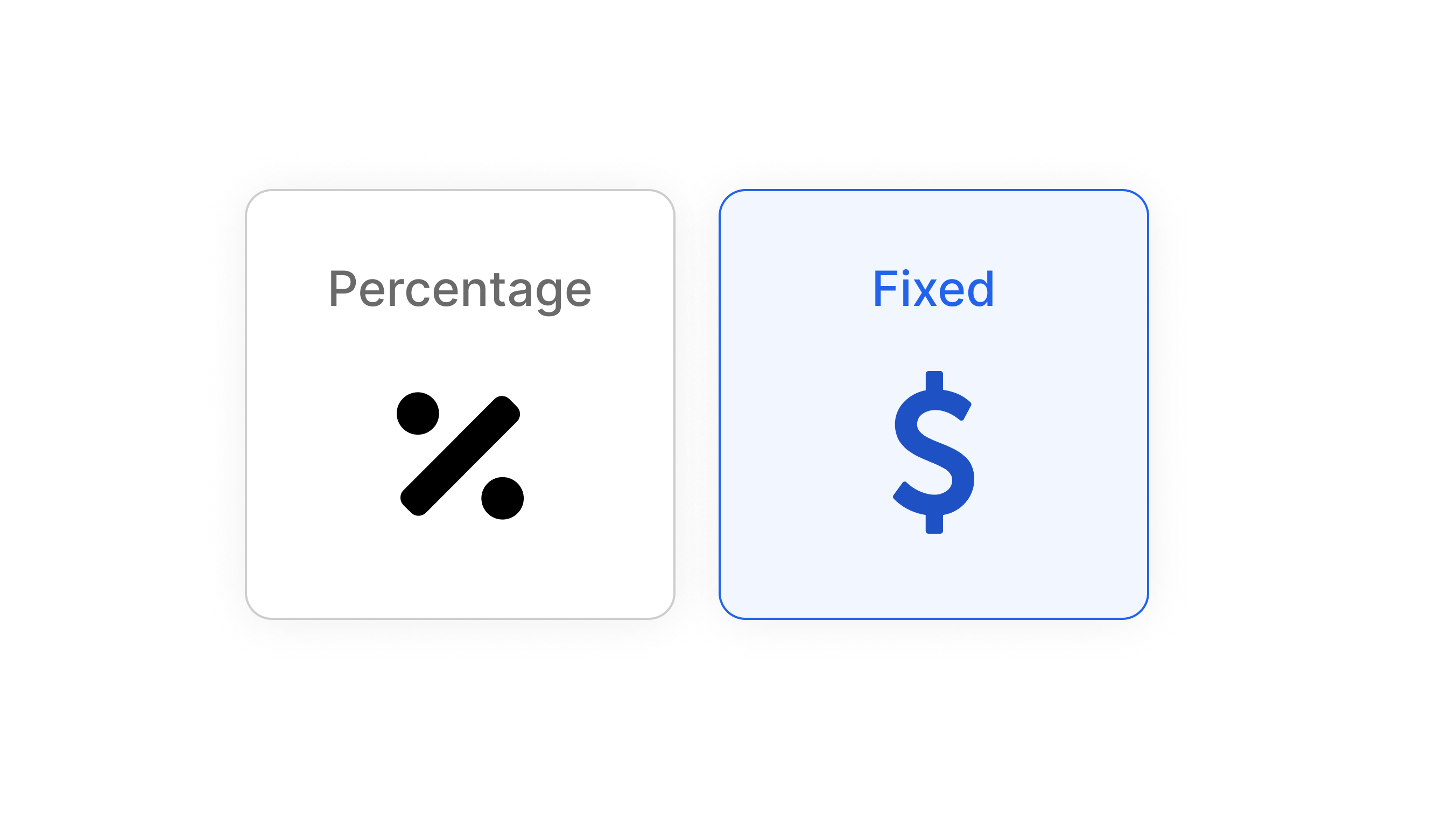
Discount all courses by the same percentage or apply a fixed discount.
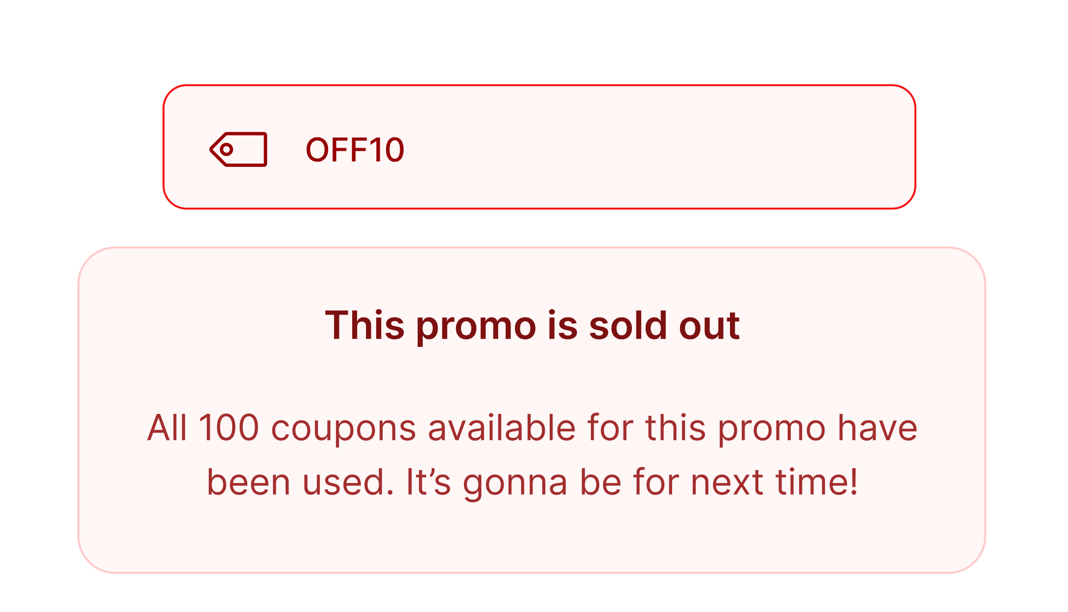
Limit your promotion to a maximum number of uses. If a member tries to use it after it has ended, they will be notified that the promo is sold out.
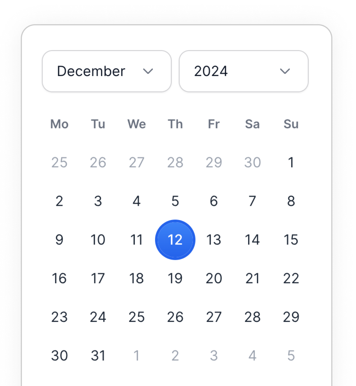
End the promotions by a certain date and time, according to your timezone.
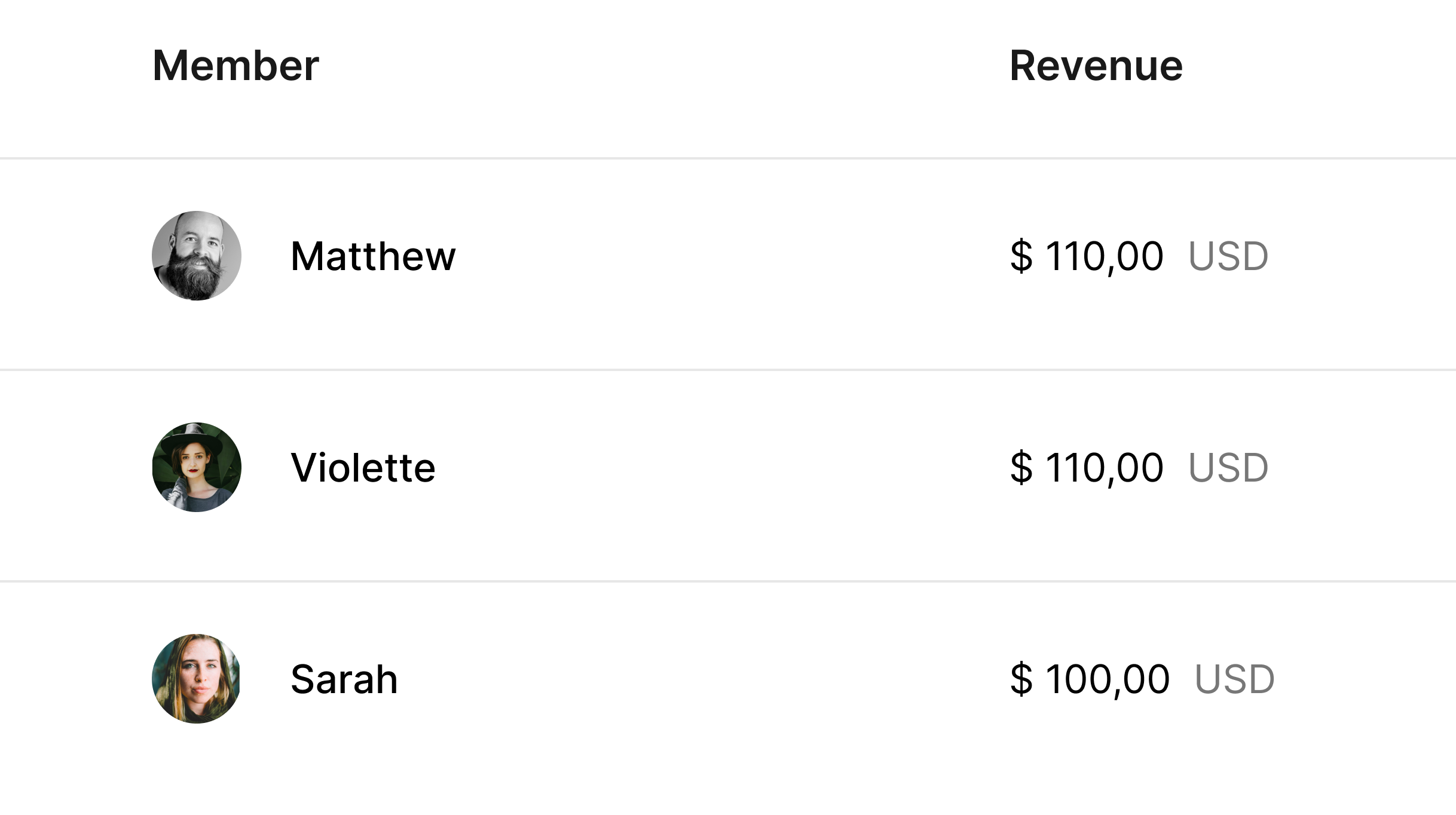
Always know how much revenue a coupon has brought in and the members who've used it.
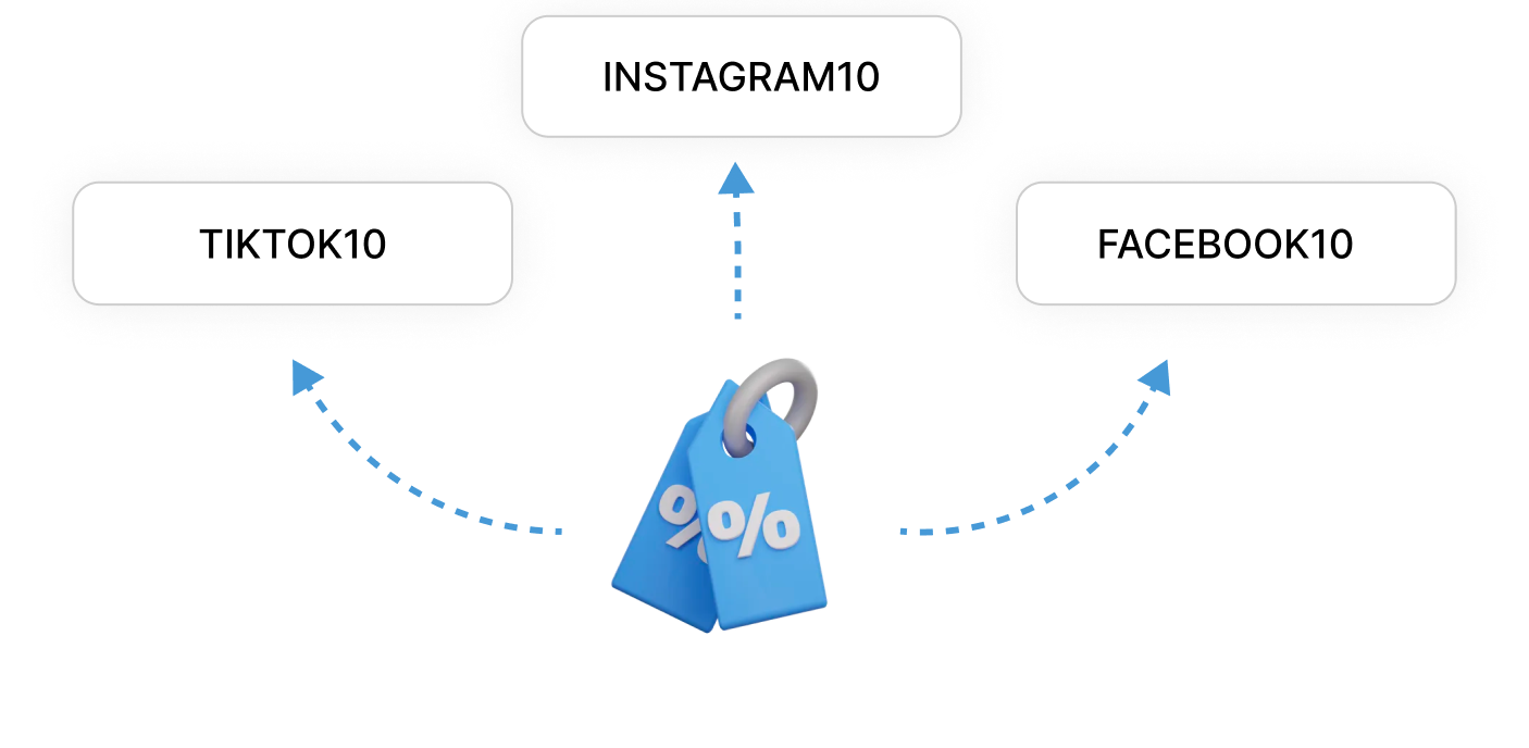
To track where members are coming from and which promos converts the most, create multiple discount codes for the same coupon.
Platform
Our goal is to give you all the perks of owning a proprietary platform, but without the expenses and hassles of development and maintenance.
Upload your logo, both for the light and dark themes. It appears on all pages of your platform in the top left corner.
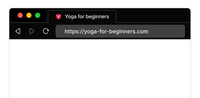
It allows your platform to be easily found when many browser tabs are open. It is also used as an icon for your web app on smartphones.
Set up a custom domain for your platform. It increases the perception of being a premium brand and makes your name more recognizable.
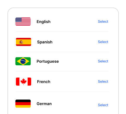
Any well-thought funnel or conversion strategy can become useless if the platform does not speak the language of its members. Any language can be implemented upon request.
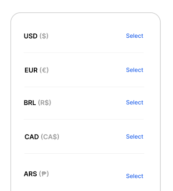
If you sell in a local market, showing the correct currency avoids confusion among your members while thinking about purchasing your courses.
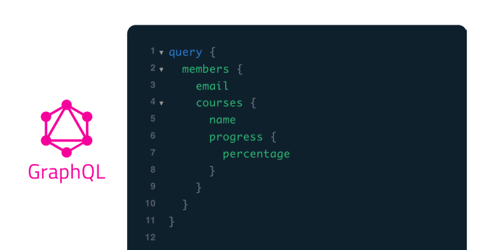
You can always access via API all your member's data, comments, purchases, discount codes, everything!
With light and dark modes already integrated, your members will love following your courses even in low light conditions and when suffering from eye fatigue.

Set the links to your Terms of Use and Cookie Policy, and your platform will take care of displaying them where necessary.
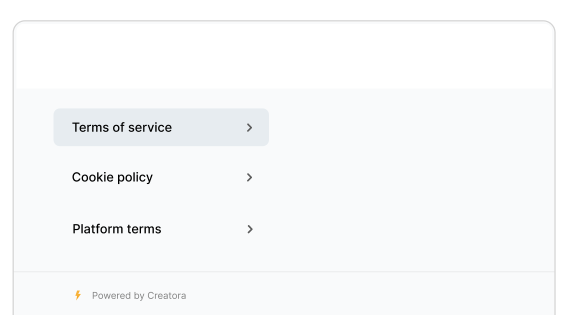
For European users, the platform enables dinamically tracking services like analytics only after cookies have been accepted.

Banner
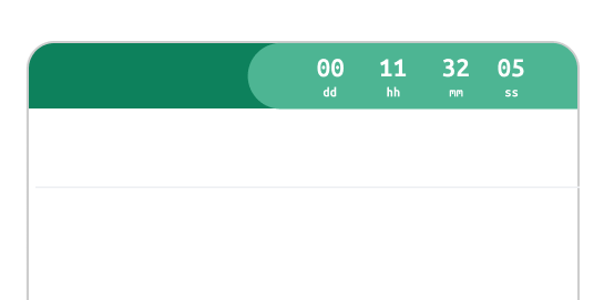
The banner is located at the top of the platform, making it visible to everyone. This way, you can communicate news and remind of any active promotions.
Set a link for the banner, either internal to the platform, like a link to a course or to checkout, or external.
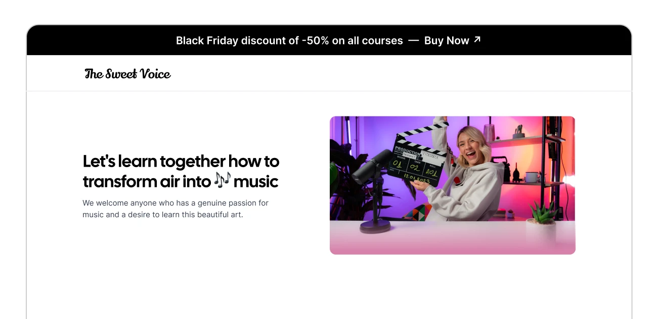
Choose one of the 5 available styles for the banner based on the type of message you wish to communicate.

Display a countdown within the banner to show the start or end of an event. When it expires, the banner is automatically hidden.
Home Page
The home page is structured to welcome new users to your platform and to help members resume their courses.
Pick reviews from courses and display them to visitors at the top of the home page to leverage social proof.

On the right side, there is always a section that suggests the next step. If it's a visitor, it invites registration, if it's a member, it suggests purchasing or continuing a course.
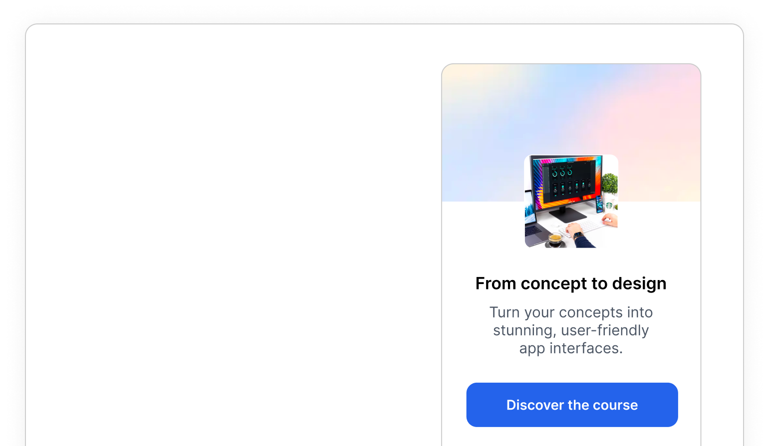
You can customize the home page with more than 12 ready-to-use blocks, using our landing page builder.
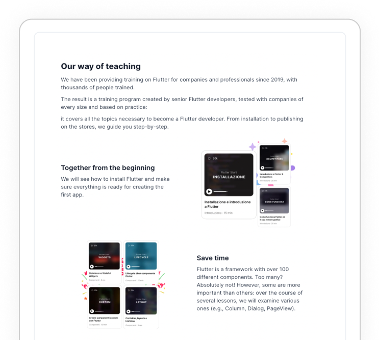
Courses are displayed, by default, on the home page. When members are logged they see their progress as well.
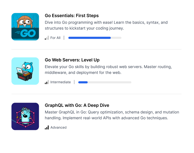
When you have learning paths the course section is replaced by it. It displays which courses have been purchased and their individual progress.

Communicate to your members the most important news regarding your courses and brand, and publish upcoming events.
SEO
Optimizing SEO is a technical and complicated job, but it's essential to acquire more users organically and increase sales.
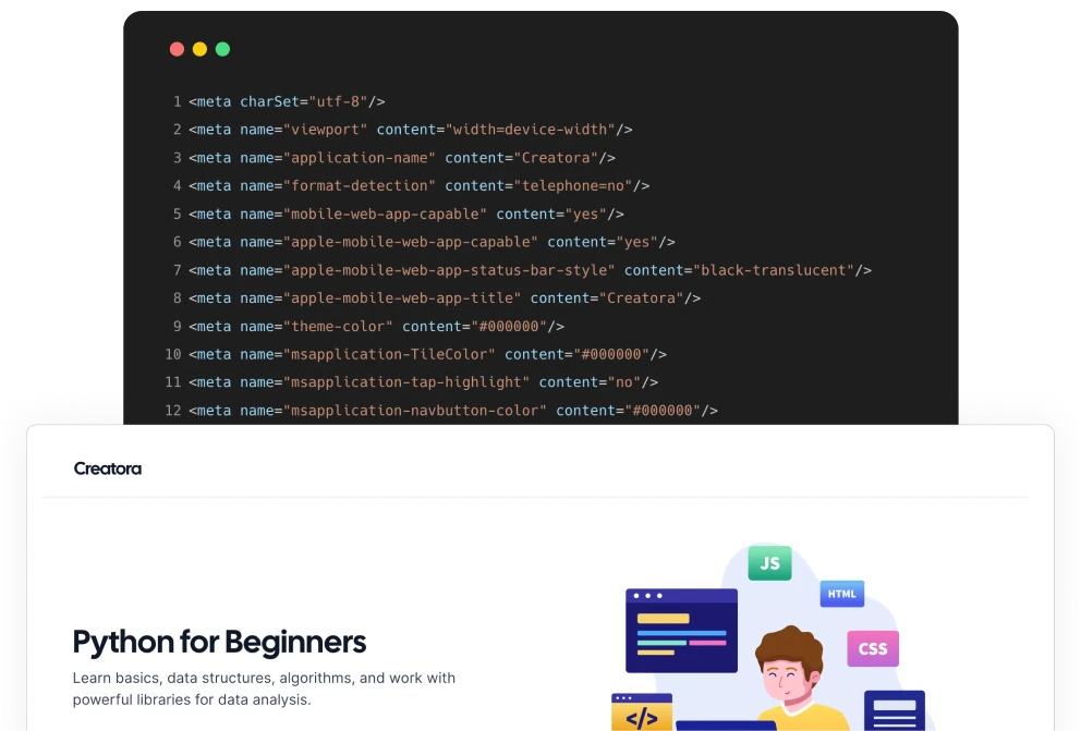
Every page of the platform contains meta tags and the semantic HTML structure to be understood and indexed by Google.
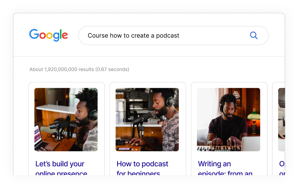
Your platform dynamically generates JSON-LD for your courses, which allows Google to display them as products at the top of search results.
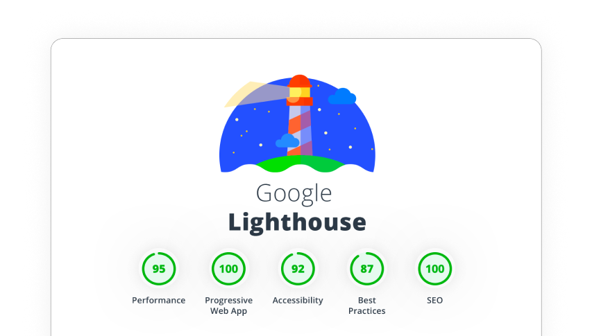
To be highly performant, the platform uses cutting-edge technologies like NextJS and GraphQL, leverages global CDNs, and minifies assets automatically.
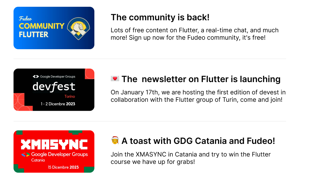
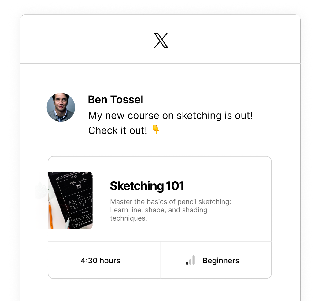
When you share a link of the platform on social media or in chats, the preview image is dynamically generated to be visually appealing and contain useful information.
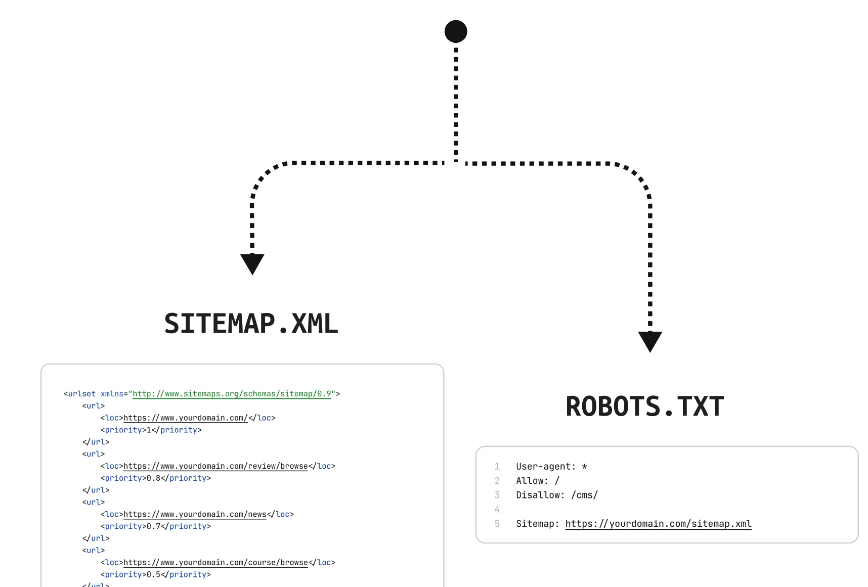
These two files are generated and updated automatically, allowing Google to quickly index all your platform pages.
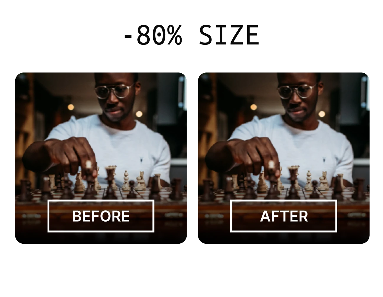
This image format is the new standard for the web because it's very lightweight. All the images that you and your members upload are automatically converted.
Integrations
Extend your platform with the services you need. If you can't find a service, we are ready to add it.
Mailchimp

ConvertKit

ActiveCampaign


Fathom


MixPanel

June

WebHook

Stripe

PayPal

Klarna
